The quick way to produce a banner campaign is to design one banner, say a 300×250 or a 1080×1080, and resize it to every other format. This guide shows why that breaks down once the shapes get far apart, and what it means to compose a banner for each shape instead.
The arithmetic of aspect ratios
A banner’s aspect ratio is its width divided by its height. A 300×250 is 1.2, close to square. A 728×90 is 8.1. A 160×600 is 0.27. The leaderboard is about thirty times as wide, relative to its height, as the wide skyscraper. No single arrangement of logo, headline, image and button works at both ends of that range.
Take a 300×250 and try to turn it into a 728×90. There are three ways to do it, and each one fails.
- Scale to fit. The height has to shrink from 250 to 90 pixels, so everything shrinks to 36%. The banner becomes a 108×90 island in a 728-pixel strip, and a 24-pixel headline ends up under 9 pixels tall.
- Scale to fill. The width has to grow from 300 to 728 pixels, so everything grows by a factor of about 2.4. Only about 15% of the original height still fits in the frame, so the headline, the logo or the button gets cut off.
- Stretch. The banner fills the frame, but the type, the logo and the photo are distorted. Brand guidelines exist to prevent exactly that.
The same happens going the other way, from a square to a tower, and from a feed image to a Story. Between different shapes, the layout has to change.
Resizing is still the right tool within one shape. A 300×250 and a 336×280 share a ratio of 1.2, so one composition serves both. The same goes for 1200×628 and 1200×627. Even then, check each format’s safe zone and minimum type size: a floor of 10 pixels does not shrink with the banner.
Five shapes, not thirty-five sizes
You do not need a separate design for every size. Sizes with a similar ratio can share a layout, so Sizewright sorts its 37 formats into five shapes by ratio.[1]
| Shape | Ratio (width ÷ height) | Sizes in the catalog |
|---|---|---|
| Strip | 4 or more | 728×90, 970×90, 468×60, 320×50, 300×50 |
| Landscape | 1.25 to 4 | 970×250, 800×250, 320×100, 1200×628, 1200×627, 1920×1080, 1920×600, 1200×400, 600×200 |
| Square | 0.8 to 1.25 | 300×250, 336×280, 250×250, 200×200, 1080×1080, 1200×1200, 1080×1350, 960×1200 |
| Portrait | 0.45 to 0.8 | 300×600, 320×480, 1000×1500, 1080×1920 |
| Tower | under 0.45 | 160×600, 120×600, 300×1050 |
Two results are worth noting. The 970×250 billboard is a landscape, not a strip, so it has room for a subline. And 4:5 feed images such as 1080×1350 count as square: at a ratio of 0.8, they sit on the square side of the line.
A minimum type size per format
Scaling also ignores a rule that should never bend: text has to be readable at the size it is shown. Sizewright sets the minimum text size at 4% of a banner’s shorter side, and never less than 10 pixels.
| Format | Shorter side | Minimum text |
|---|---|---|
| 728×90 | 90 px | 10 px[2] |
| 300×250 | 250 px | 10 px |
| 300×600 | 300 px | 12 px |
| 1200×628 | 628 px | 25 px |
| 1080×1920 | 1080 px | 43 px[3] |
In pixels, a Story needs text more than four times as large as a medium rectangle. A design scaled from one to the other has no reason to land on the right size.
What moves where in each shape
Composing means the elements stay the same while their arrangement changes. The logo, the headline, the image and the button appear in every size, each placed where the shape has room for it.[4] The brand colors, the fonts, the logo’s clear space and the reading order stay constant too: the reader meets the brand and the headline first, and the button last.
- Strip: one row. Logo on the left, headline in the middle, button on the right.[2] The subline drops out, and the image becomes a narrow slice or drops out too.
- Landscape: two columns. Text on one side, image on the other, with room for a subline under the headline.
- Square: a split or a stack. The image takes half the frame or sits behind the text, and an offer can get a block of its own.
- Portrait: image on top, copy below. There is room for the long headline, the subline, the button and the logo.
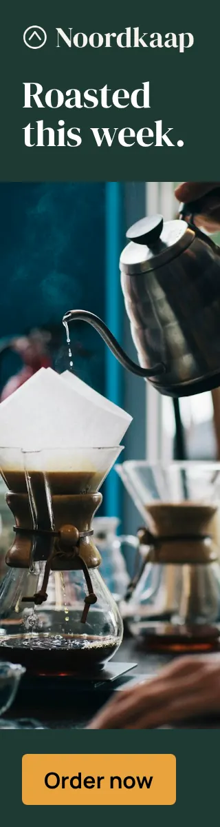
- Tower: a column. Logo at the top, the headline broken over several lines, the image in the middle, the button at the bottom.

Copy in three lengths
A layout can move elements around, but it cannot make a headline shorter. That is why composed campaigns are written with copy in more than one length:
- a headline in a short, a medium and a long version
- an optional subline, also in three lengths
- a button label in a short and a long version[5]
In the Noordkaap example, the strip and the tower use a short headline: “Roasted this week.” The 1080×1920 version of the same campaign has room for a longer one, with a subline under it: “Freshly roasted, delivered every week.”
Sizewright fits the copy in a real browser, with up to ten attempts per banner. When the text does not fit, it switches to the short button label first, then to shorter sublines and headlines, and finally drops optional lines.[4] The guide to banner copy covers how to write those versions.
How Sizewright composes a set
Each of Sizewright’s twelve layout families, from split field and full bleed to offer block and listing, has a composition for each of the five shapes.[5] For every banner, two layout variants are rendered and the better one is kept.[4] Every result is then checked against the measured rules, including minimum type size, overflow and safe zone.[6]
You can browse the layout families and their compositions in the templates, see how a campaign covers every size in every format, and look up any single size in the banner size guide.
Sources
-
Sizewright, “Banner sizes: every ad format with its specs”, /banner-sizes, checked 16 October 2026. back
-
Sizewright, “728×90 Leaderboard: specs and design guide”, /banner-sizes/728x90-leaderboard, checked 16 October 2026. back back2
-
Sizewright, “1080×1920 Meta Stories and Reels: specs”, /banner-sizes/1080x1920-meta-stories-reels, checked 16 October 2026. back
-
Sizewright, “Every banner format, composed for its shape”, /features/all-formats, checked 16 October 2026. back back2 back3
-
Sizewright, “AI art direction for banner campaigns”, /features/ai-art-direction, checked 16 October 2026. back back2
-
Sizewright, “Quality control for every banner”, /features/quality-control, checked 16 October 2026. back